Jeff Parsons
Product / UX designer and researcher
Jeff Parsons
Product / UX designer and researcher
Designing for a refresh and re-platform of the AA Insurance website, implementing new styles, layouts and content.
I reimagined the website’s content and the way it was organised, designed new mobile-friendly layouts, and updated the UI design system to modernise and improve usability.
The existing website navigation menu lacked visual hierarchy, was inflexible to new content, and had an outdated aesthetic. I wanted to correct those issues and bring the navigation more in line with customer expectations, in part set by competitors.
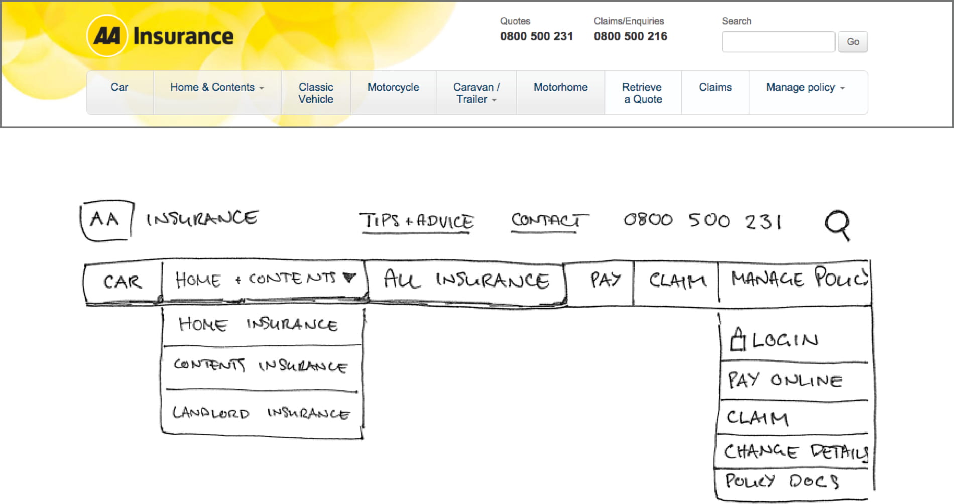
After a stock-take of all existing and new content areas on the site, I sketched new options to discuss with stakeholders. With different teams each having an interest in promoting their content, it was important to frame stakeholder conversations around user needs.
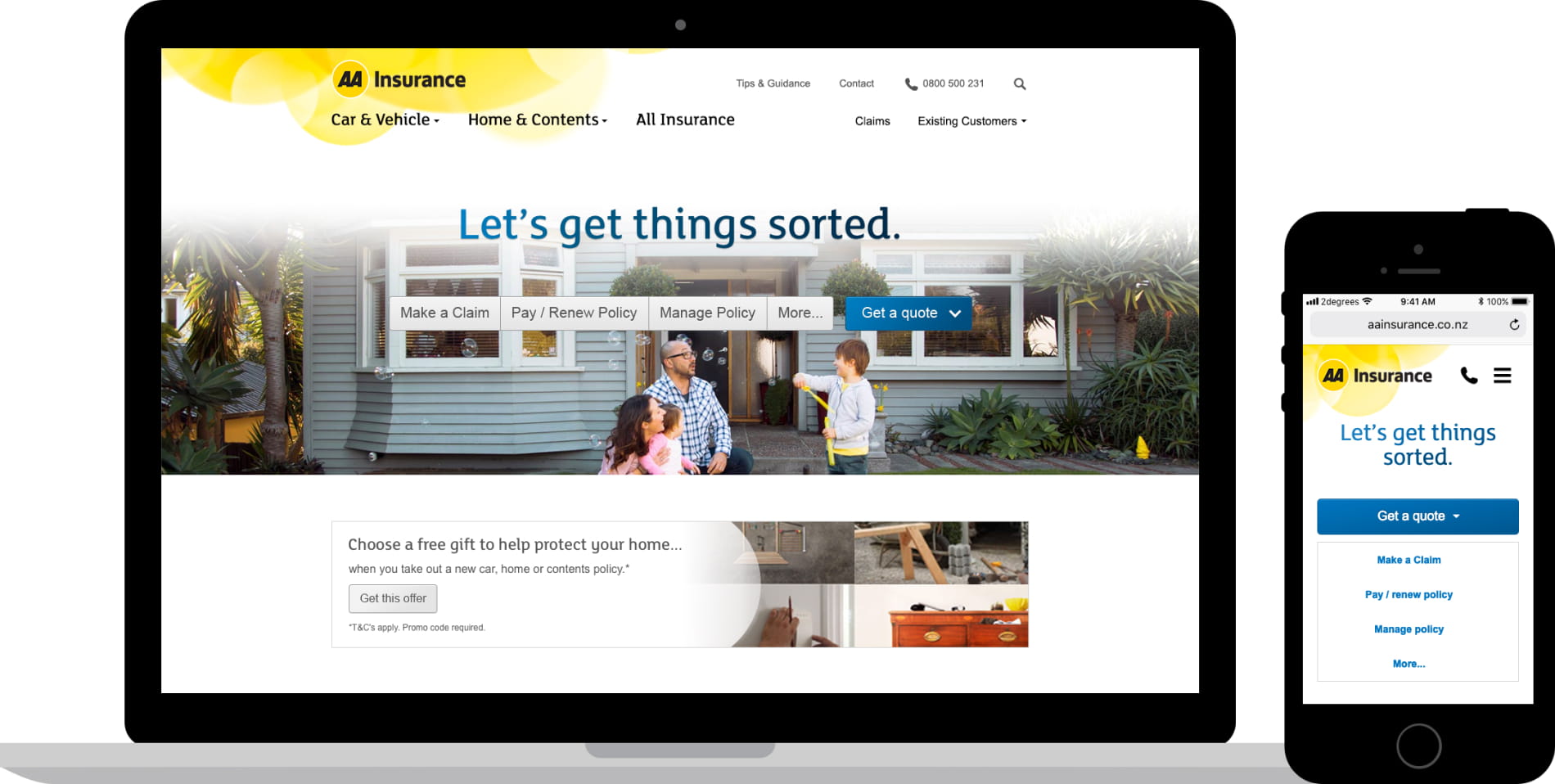
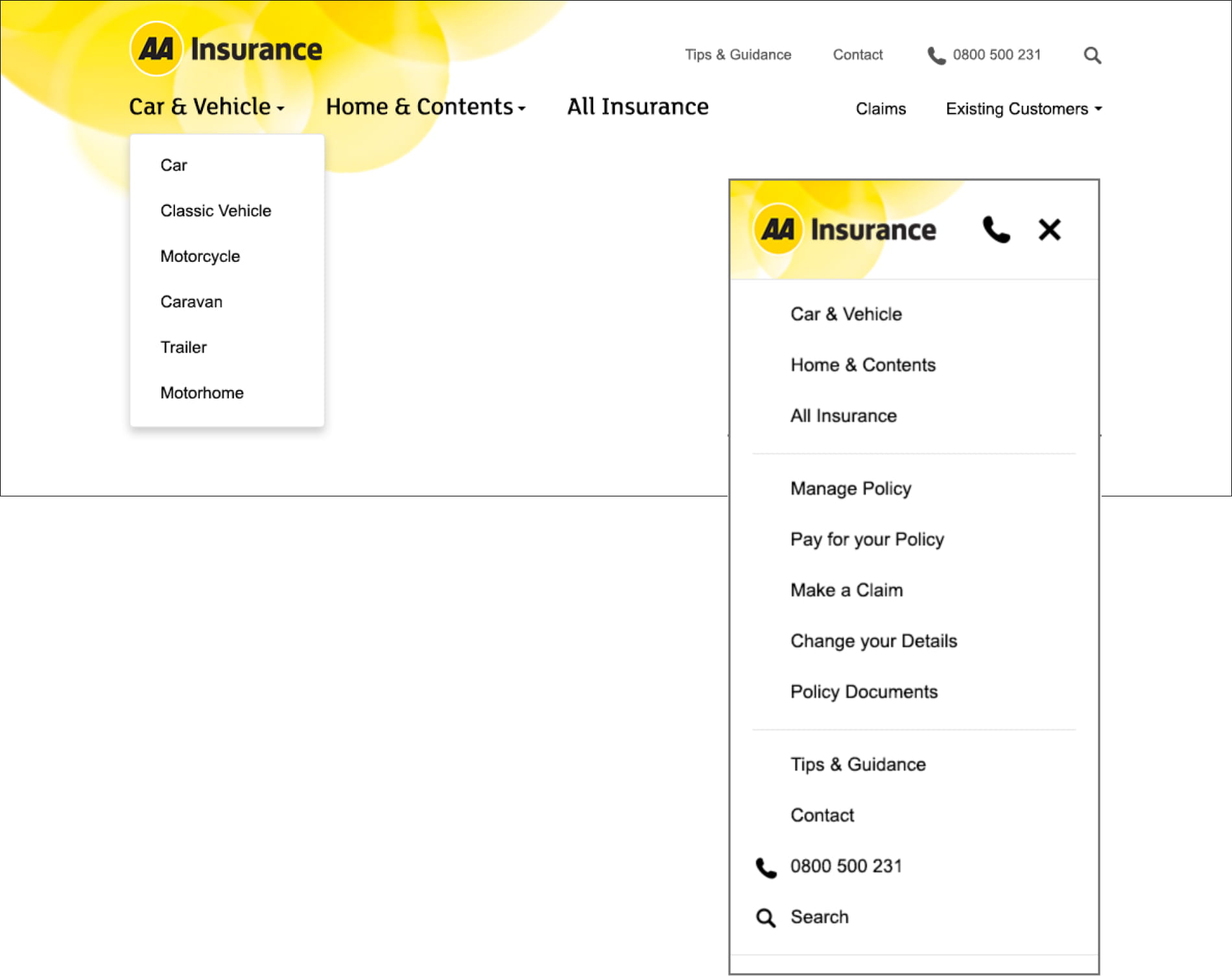
To make the header easier to scan and comprehend, I introduced a clear visual hierarchy, following established UI patterns and element placement. There was no need to reinvent the wheel here, but the use of type, iconography and space contributed to a cleaner and more usable site navigation.
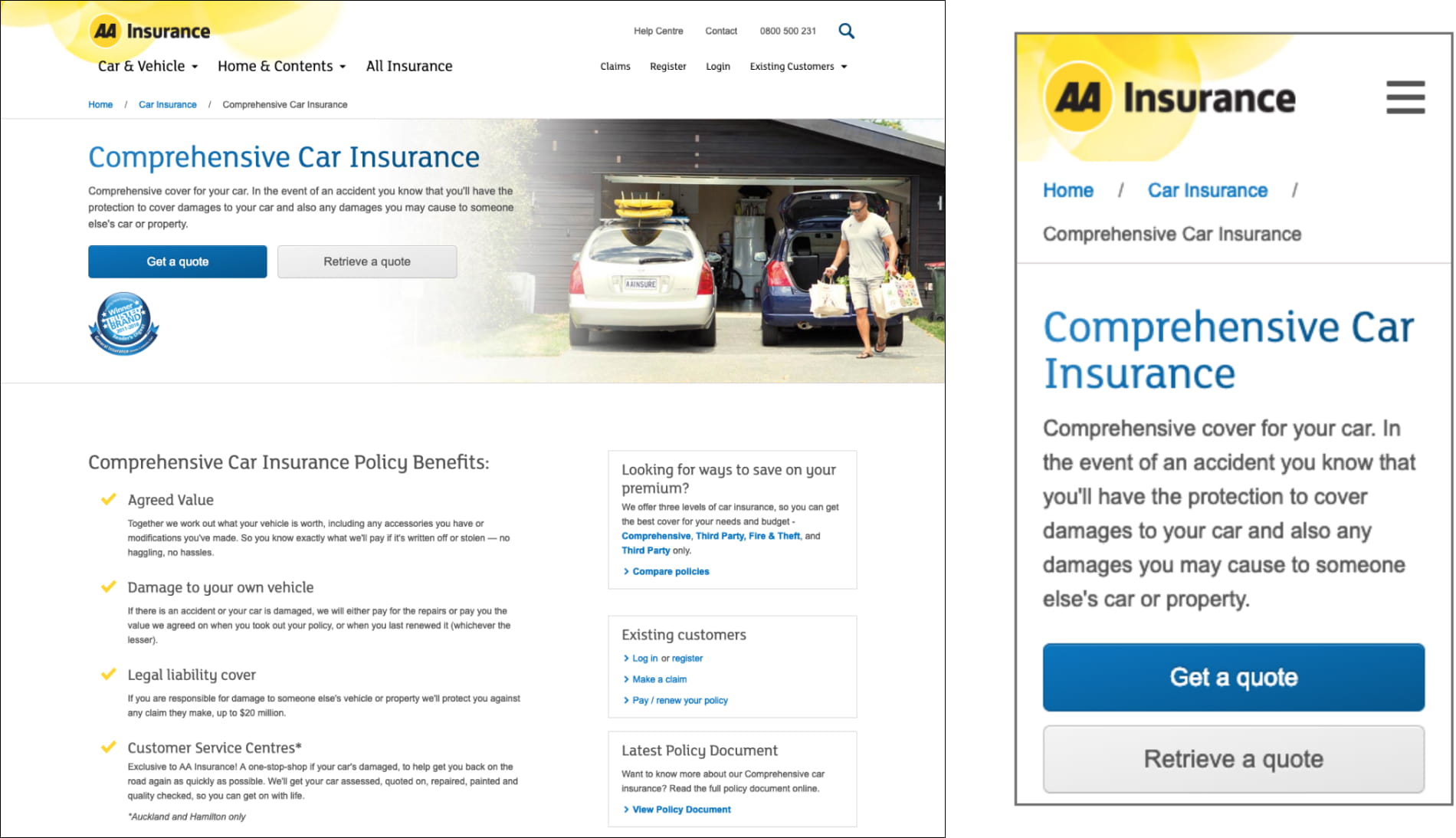
With the opportunity to reorganise, cull and extend the site’s existing content, I wanted to think about the purpose of each page and the user needs at each point of their flow. As a new approach began to take shape, something tangible was needed to facilitate focused discussions with stakeholders about how to arrange content, and what to include.
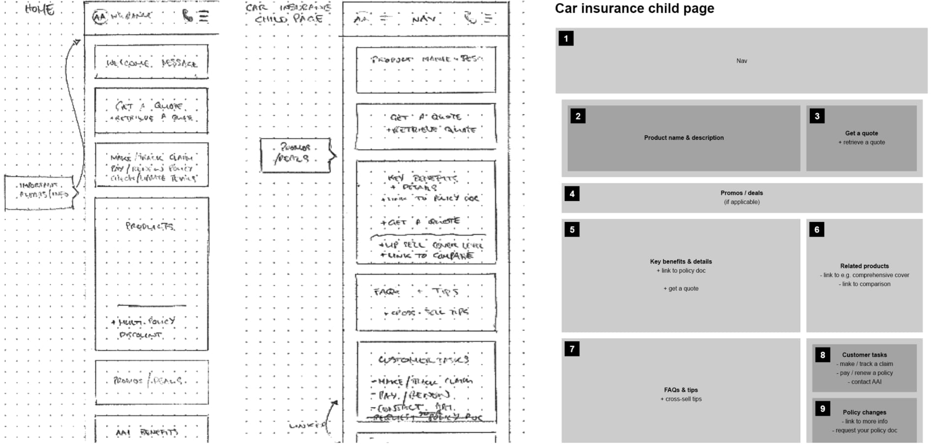
Using low-fidelity artefacts can be useful in some cases to keep stakeholder conversations focused on content and user flow, as opposed to getting distracted by the UI and visuals. Sometimes this can make concepts too abstract and difficult to talk to, but in this case it initially seemed the best approach.
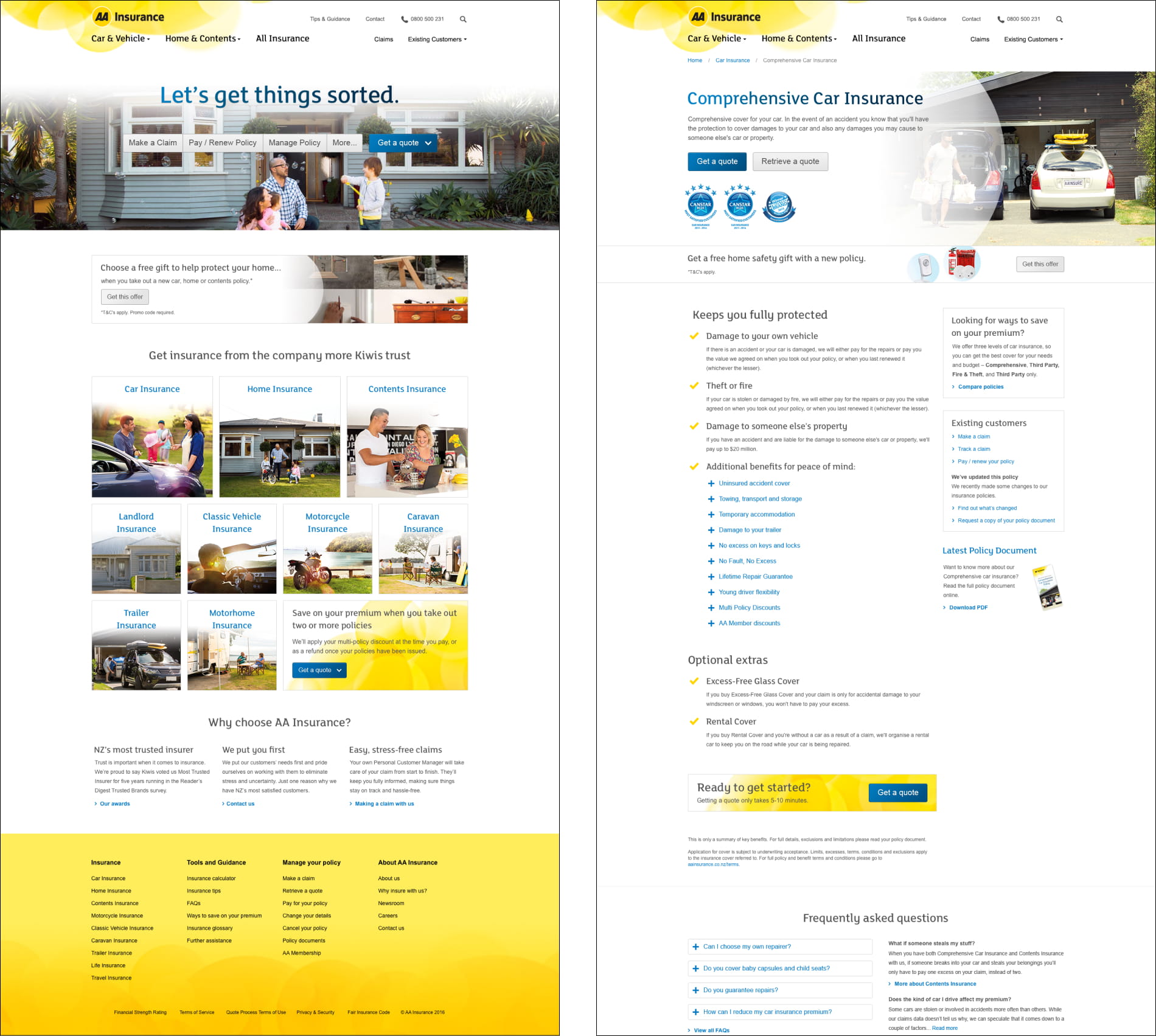
When moving to high fidelity designs, consideration was taken to visually balance all types of content and actions, e.g. primary actions of getting or retrieving a quote, brand look and feel, functional usability and find-ability of information, placement of related links and supporting content to aid way-finding.
In hindsight, perhaps spent too much time was spent working out page layouts in low-fidelity. While it can initially be useful to think about content blocks and their relative importance on a page, it is difficult to visualise an experience in the abstract.
Progressing more quickly to a skeleton user interface may have made stakeholder engagement more efficient and reduced back and forth later in the project.