Jeff Parsons
Product / UX designer and researcher
Jeff Parsons
Product / UX designer and researcher
Designing a component-based UI design system for the re-design and re-platform of the brand’s website.
Provided with initial page mockups and a basic style guide, I designed a component-based UI design system and supervised the implementation from a design perspective.
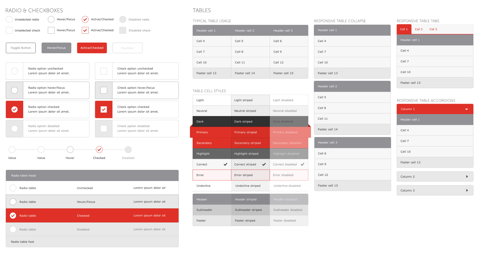
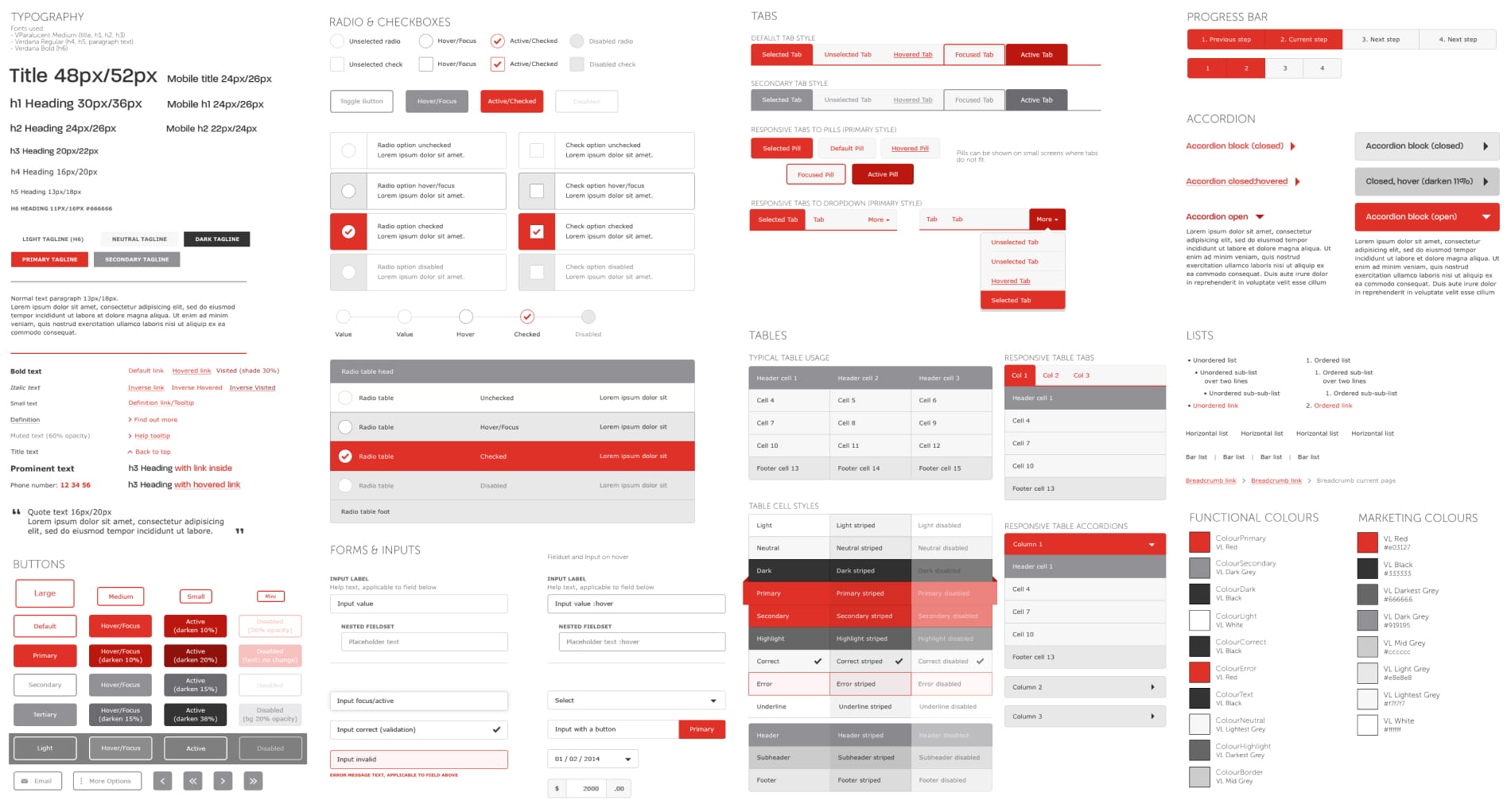
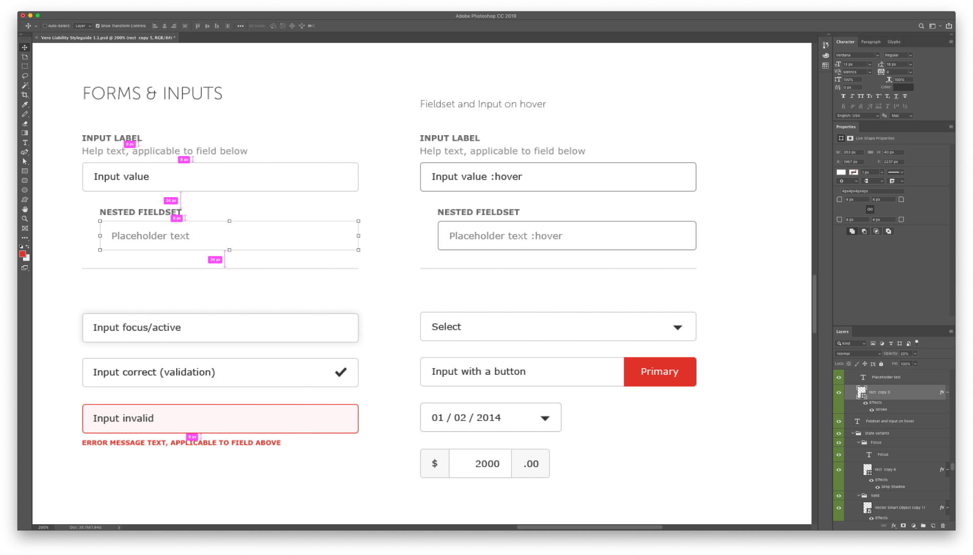
This work was in the context of a complete redesign and re-platform of a website. Another team had created page mockups and a basic style guide, but the extensive set of UI patterns and components on the new platform required a robust, new set of styles.
Respecting the established look and feel, I expanded the system out to address all the elements, patterns and components required. A key consideration here was to maintain consistency across all element and their various states, with the use of colour, type, iconography and space.
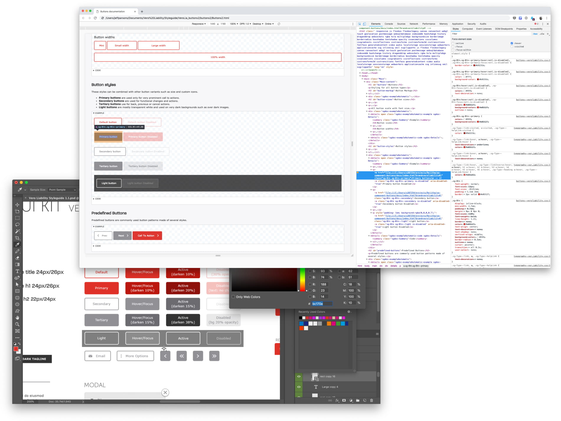
During development, I collaborated closely with engineers to inspect, give feedback and iterate on the front-end code. This involved ensuring all design decisions were realised in the end product, the components were styled in a way that would translate well to a flexible content management system, and tweaking the design to account for unanticipated functionality.
The brand had a very narrow and inflexible colour palette, with the primary colour being bright red. This proved challenging when balancing brand identity with established norms associated with web user interfaces. For example, in user interface design, red is commonly used to indicate errors, destructive actions and warnings.
Since this time, I have learnt to have greater influence in stakeholder discussions, to educate and emphasise the importance of usability, affordance and adhering to established web UI principles.