Jeff Parsons
Product / UX designer and researcher
Jeff Parsons
Product / UX designer and researcher
Designing a product landing page to introduce ‘AlphaCity’—a corporate car sharing system for employees.
I led the project, creating the concept, writing the copy, prototyping interactions, and steering the design and development through to the page’s launch.
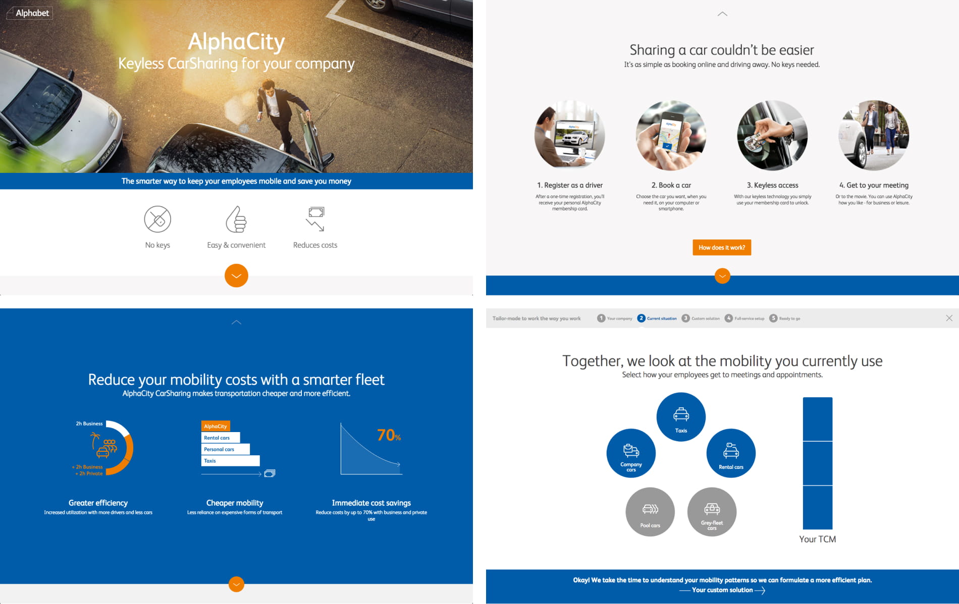
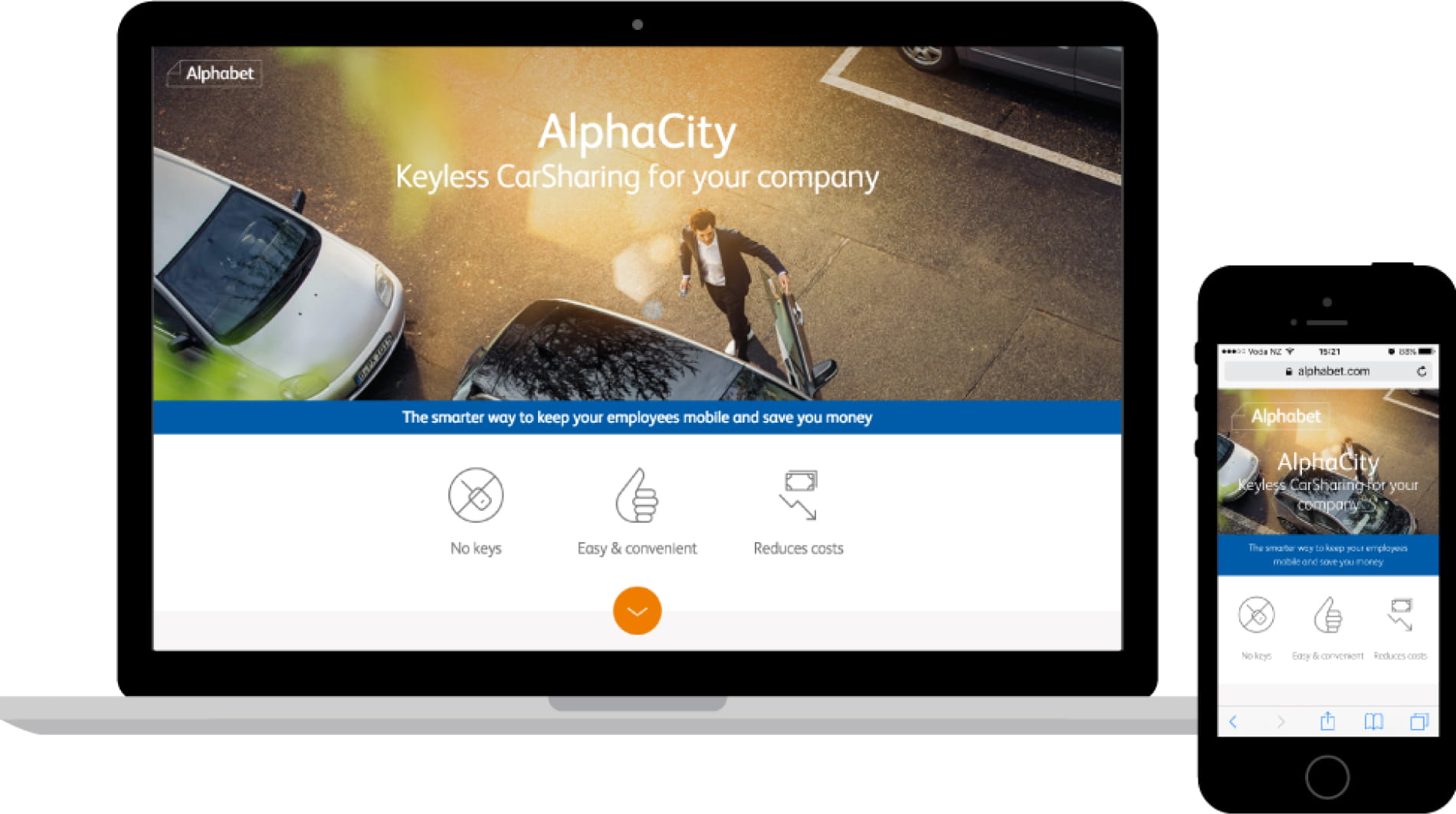
With this page, I wanted to remove all ambiguity about the product, clearly communicating how the car sharing system works and what the benefits are.
I sketched out a storyboard to present to the client and solidify the messaging before we started designing.
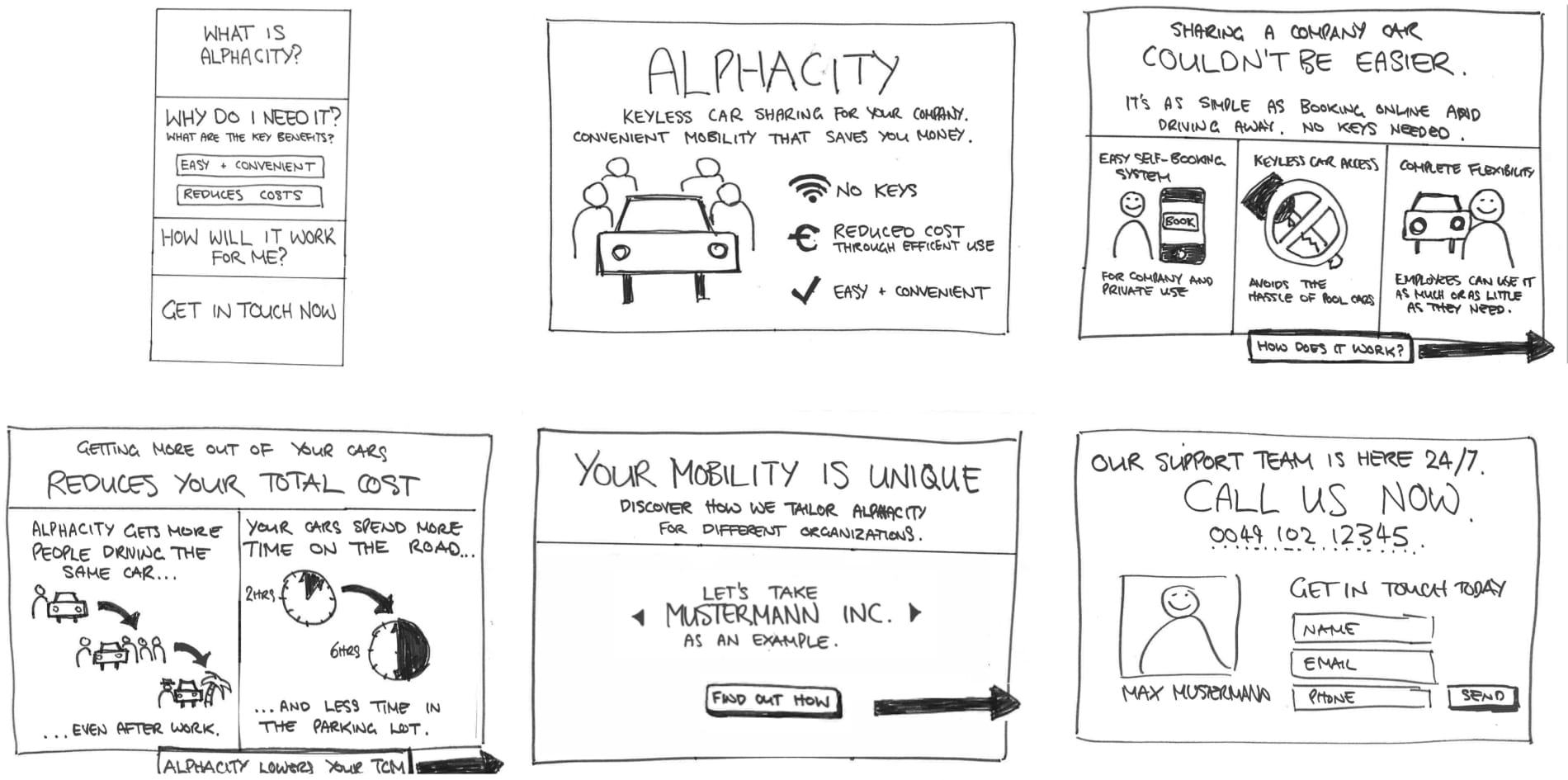
By getting feedback and understanding the essence of what we were communicating early, it meant we were more efficient in fleshing out each feature and benefit of the product with strong copy, images and animations.
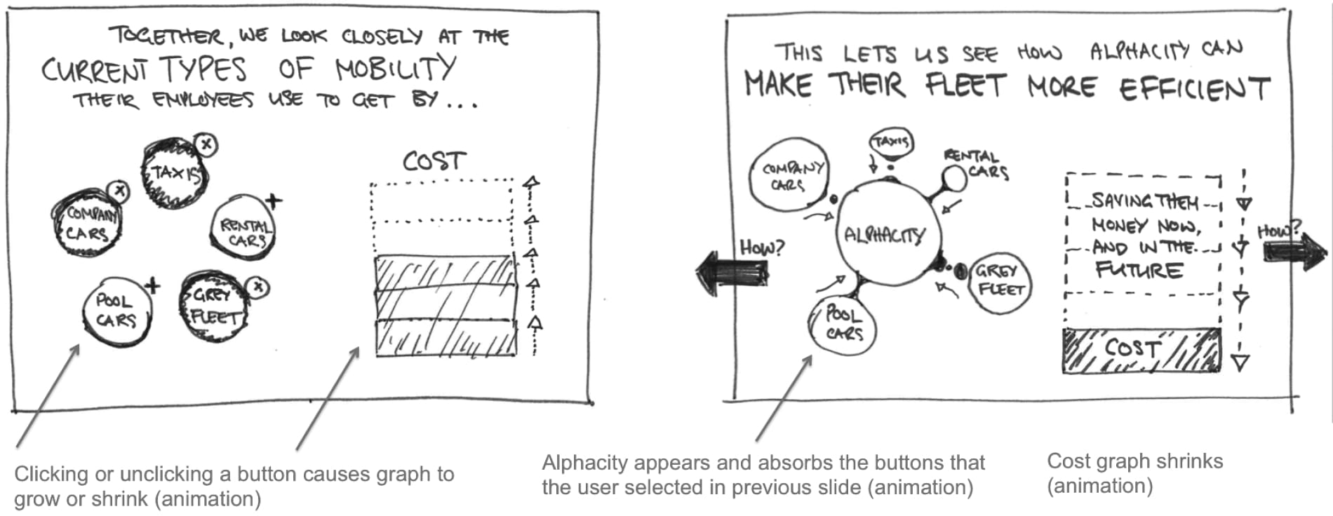
One key benefit of the car sharing system is that it can replace more expensive forms of employee transport, reducing a company’s costs.
Initially scribbled in the storyboard, I continued with the visual metaphor of taxis and company cars getting ‘eaten up’ by car sharing – the more efficient method of transportation.
Wanting to check the feasibility of using modern web animation techniques (and not waste time on something out of the project’s scope), I decided to test the idea by creating an animated prototype. Coded in HTML, CSS and JS, the prototype was a very rough exploration of possible interactions and animation effects.
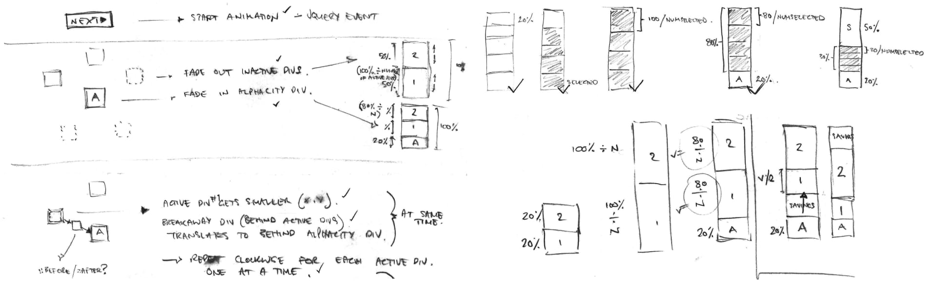
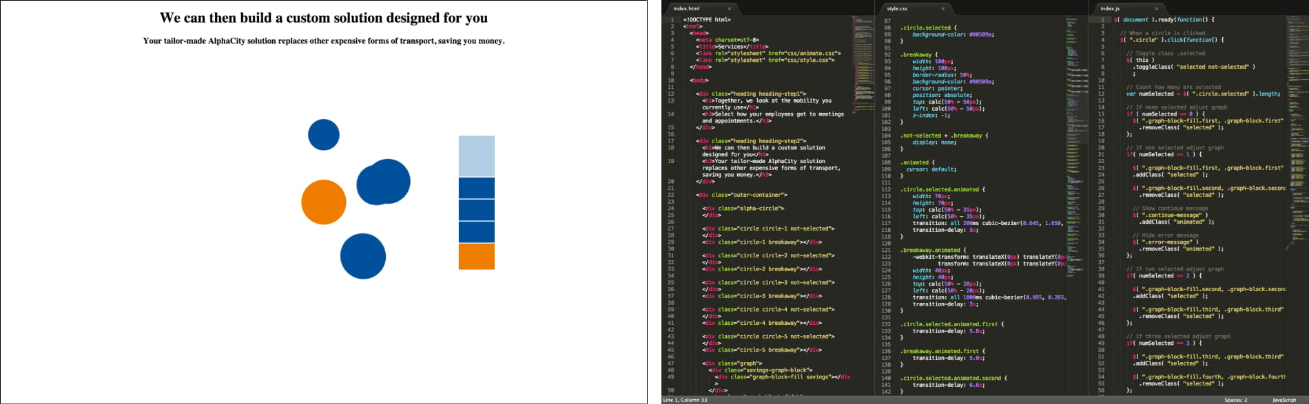
It turned out that I could achieve the desired interactive effects using JavaScript events and CSS animations, and as a time saving bonus the frontend developers could reuse some of what I wrote in the production code.
In this project I learnt that having a product’s core messaging finalised before designing mockups (different to our usual process at the time) can allow for a stronger and more compelling product experience.
With my leadership in this approach, we were able to invest more time in reinforcing the product benefits with complex animations and interactive storytelling.