Jeff Parsons
Product / UX designer and researcher
Jeff Parsons
Product / UX designer and researcher
Extending and optimising the Swiss watchmaker’s online boutique for mobile shopping.
I designed parts of the mobile interface, built prototypes for features and flows, conducted usability testing and guided the user experience throughout the project.
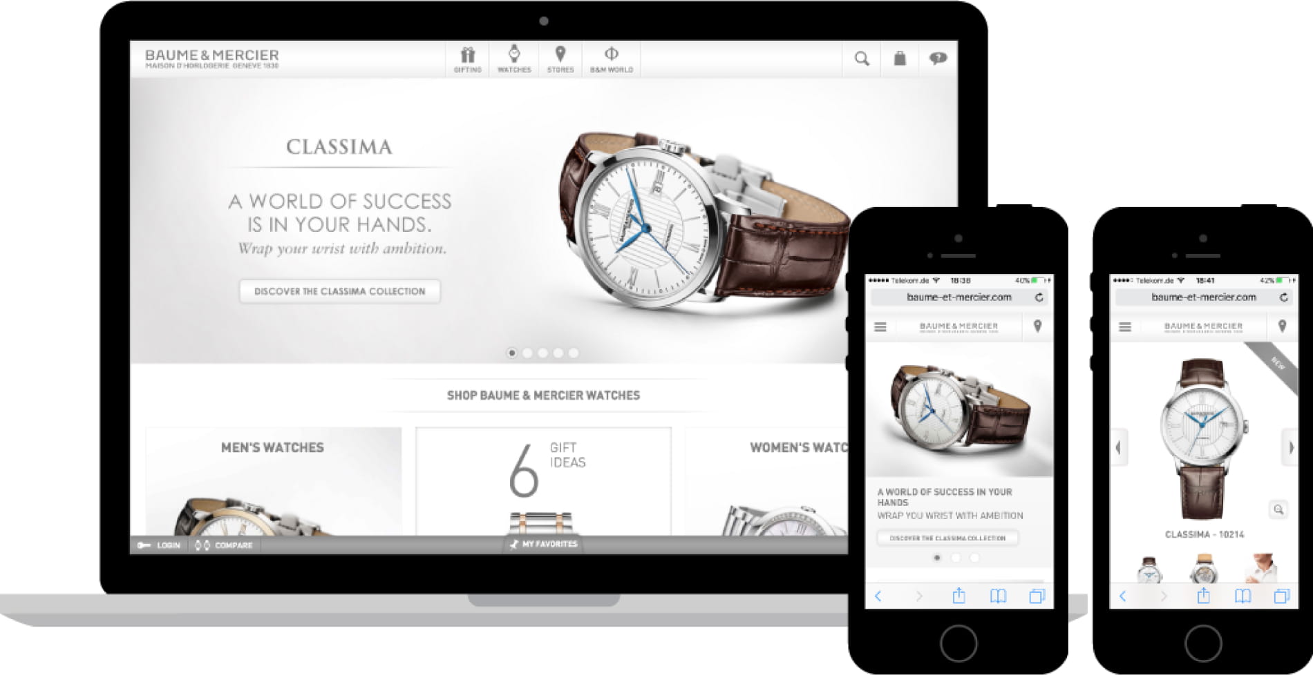
The project task was to extend and optimise an already- responsive website (on larger screen sizes) for mobile devices. Mobile-specific optimisations would include removing certain components from pages on the server-side using an adaptive approach.
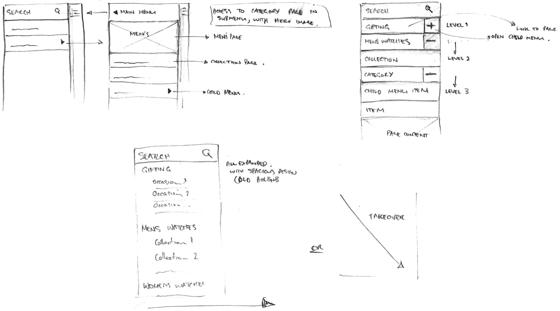
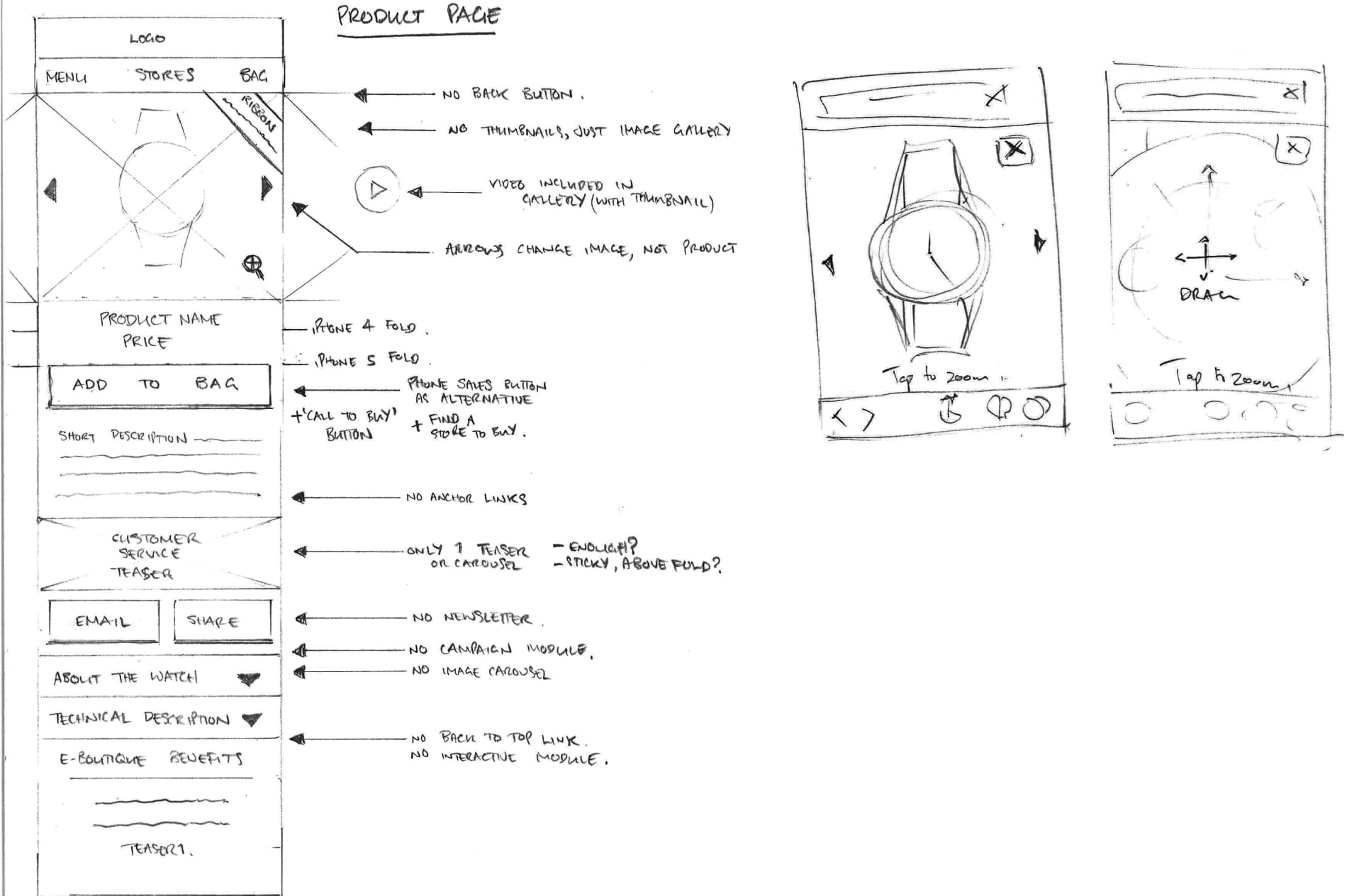
I started by sketching mobile elements to explore different layout options and patterns. For me, pencil and paper is the best method for generating initial ideas as it helps me focus only on the core problems.
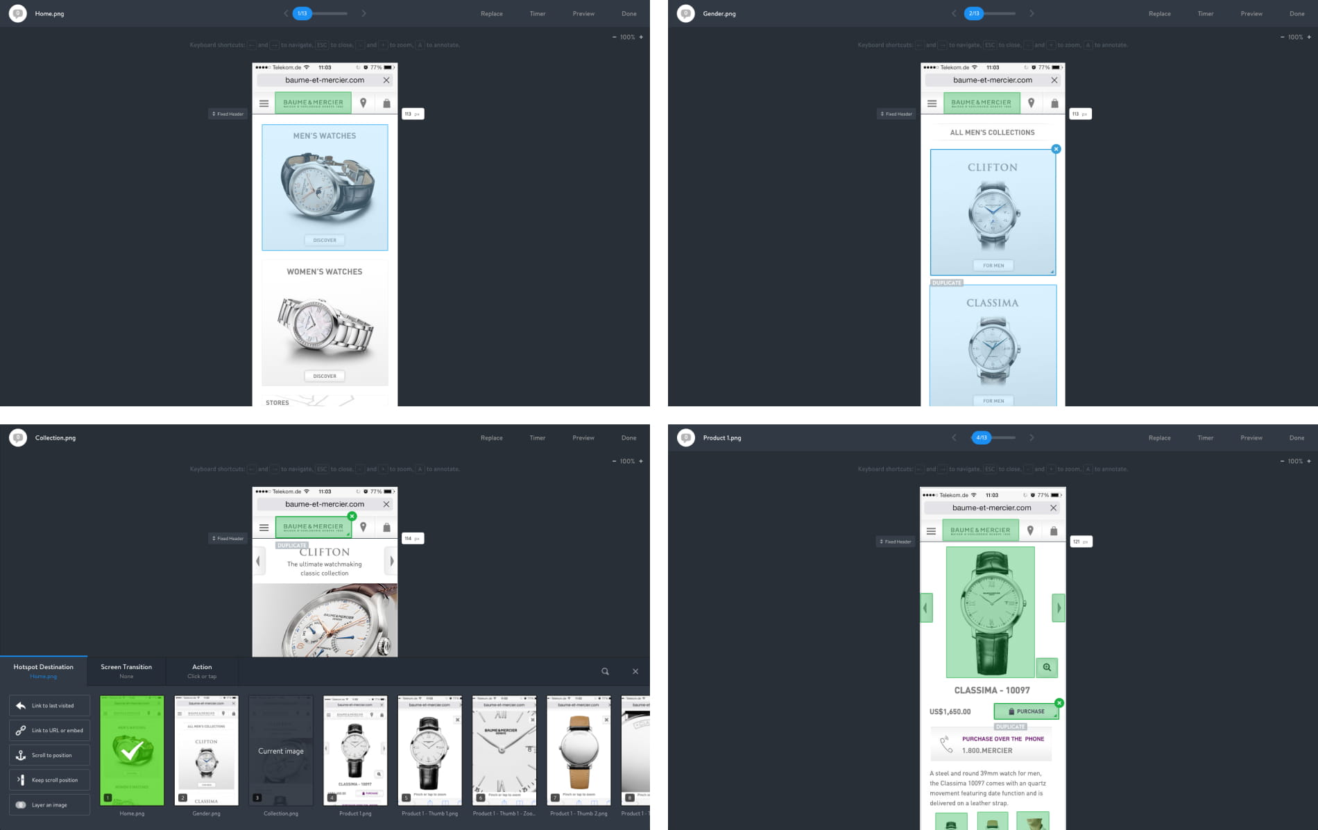
After some initial sketching, I created some basic Marvel and Pixate prototypes to get a feel for each page and discover what was working and what wasn’t.
There were some conflicting opinions among the team about the interface. For example, different people expected to arrive on different pages when following certain linked tile teasers or navigational arrows.
This led me to try and validate the design with usability testing, which I hoped would improve the UX and align the team.
For the usability testing, I asked some colleagues to use the Marvel prototypes I had created. As each participant completed a task I gave them, they gave a running commentary, which I recorded and derived insights from.
This validation process provided valuable input for subsequent design decisions and was a stark reminder that we are always making (often incorrect) assumptions about our users.
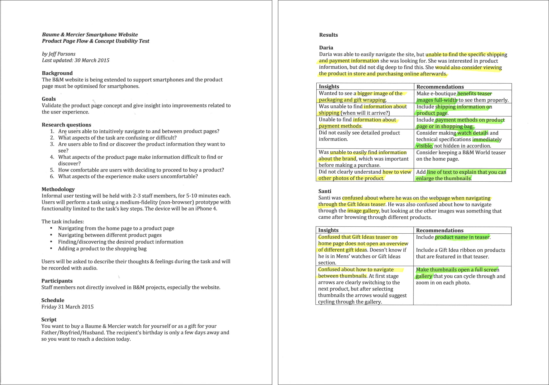
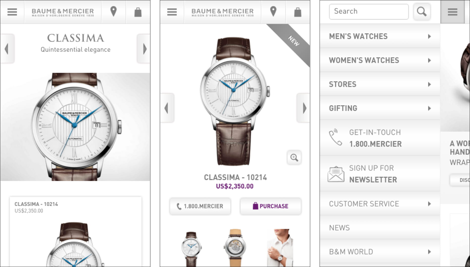
One of the insights from the usability testing was that the product page’s image gallery was too confusing. The existing gallery functionality on larger screens wasn’t working on mobile – the smaller screen meant users were getting lost.
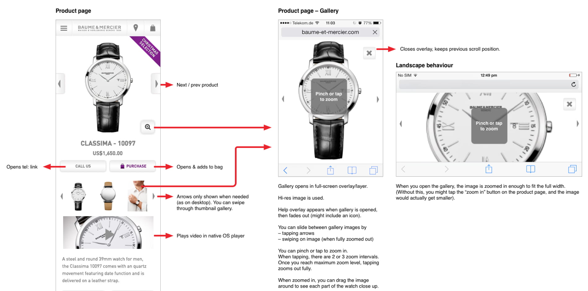
After formulating a new image gallery solution that would feel more intuitive on mobile, I created a Pixate prototype to validate it.
Using Pixate I was able to create a very realistic prototype complete with pinch, drag and tap gestures to understand exactly how the image gallery would feel to use.
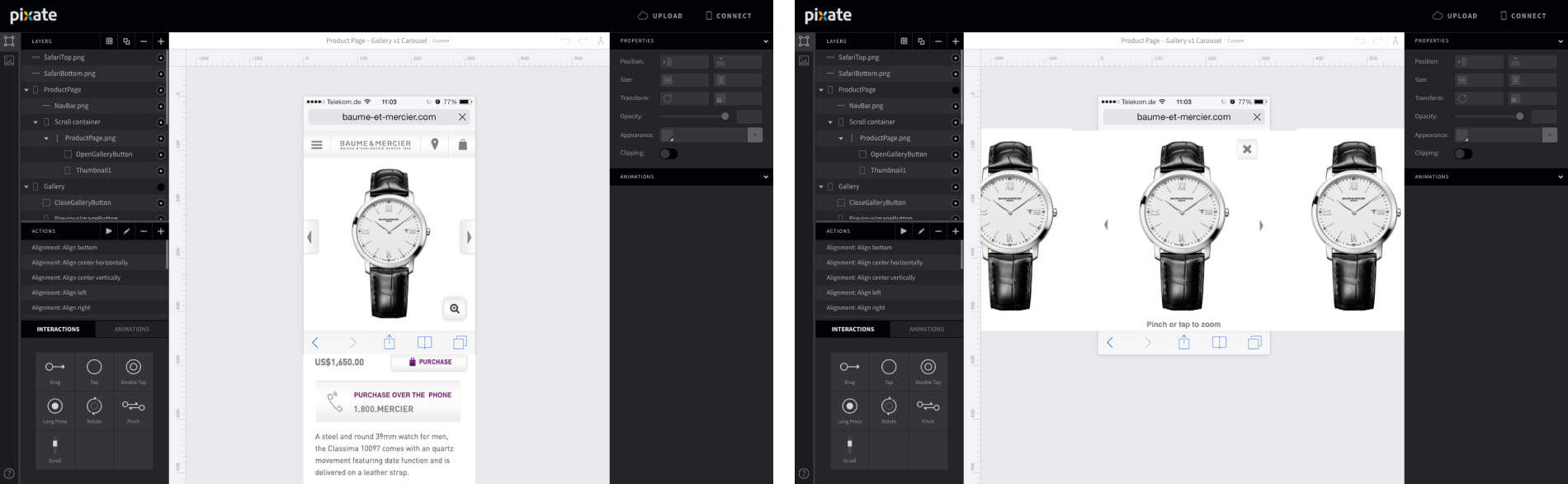
A few minor iterations later, we could confidently move forward with a validated concept. Both the development team and client then had a clear idea of what we were trying to achieve, without having to rely solely on imagination and lengthy descriptions.
My usability tests and prototypes allowed us to develop a product based on more than just opinions and assumptions. The result was a website built on solid, validated ideas that both the client and team were very satisfied with.
One of the main things I realised during this project is that I am constantly making assumptions about how users will use a product.
By incorporating prototypes and usability testing in the design process, incorrect assumptions can be spotted early – before they become expensive ‘optimisations’ during or after development.